# Trades Analysis (/platform/charts/strategies/trades-analysis)
Open the [Backtest viewer](/platform/charts/strategies#backtest-viewer), then select **Trades Analysis**. This tab looks inside the overall backtest result: how often trades win, how large wins and losses are, and how long positions stay open.
*Screenshots show an example BTCUSD backtest. Select an image to view it at full size.*
## P\&L distribution [#pl-distribution]
[](/images/charts/strategies/pnl-distribution.png)
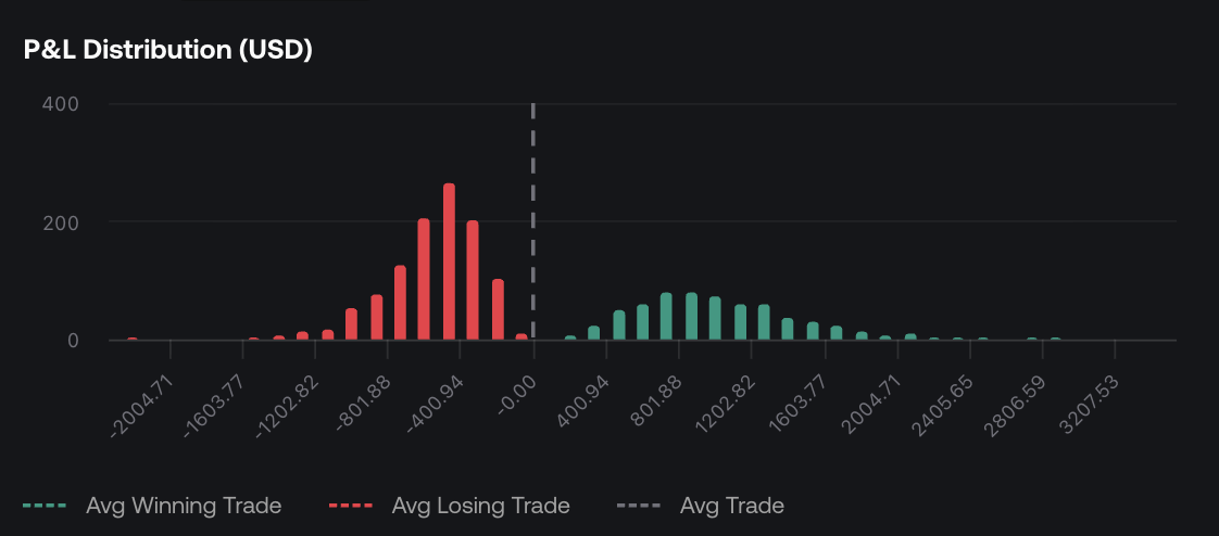
Each bar counts trades whose P&L falls within that range.
The horizontal axis shows **trade P\&L in USD** and the vertical axis shows how many trades fall in each bucket. Red bars represent losing outcomes and green bars represent profitable outcomes. The legend identifies reference lines for **Avg Winning Trade**, **Avg Losing Trade**, and **Avg Trade**.
A tall bar means many trades had a similar result. A thin tail far from the center means a small number of unusually large wins or losses. Compare the concentration of trades with those extremes to understand whether a few outliers dominate the result.
This chart groups **individual trades**. The [Simulation outcome distribution](/platform/charts/strategies/simulation#outcome-distribution) groups the ending results of entire simulated runs.
## Win rate [#win-rate]
[](/images/charts/strategies/win-rate.png)
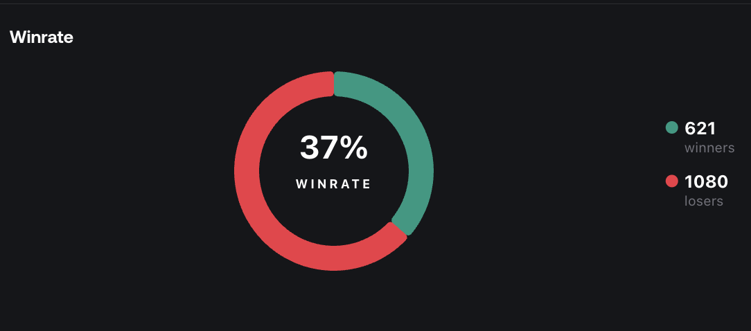
The donut summarizes how often trades won, without showing the size of each win or loss.
The donut displays win rate and the counts of winners and losers. The table below provides a more precise percentage and a separate **Breakeven Trades** count.
Read win rate together with average win and average loss. For example, six $50 wins and four $100 losses produce a 60% win rate but a $100 loss before additional costs. Winning more often does not necessarily mean making money.
## Trade statistics [#trade-statistics]
[](/images/charts/strategies/trade-statistics.png)
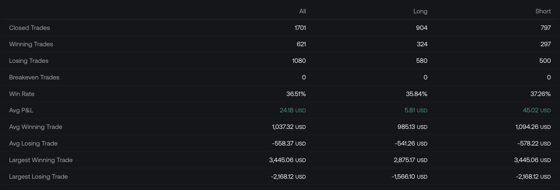
All covers the complete trade set; Long and Short separate the two directions.
| Row | Meaning |
| --------------------------------------- | ---------------------------------------------------------------------- |
| **Closed Trades** | Number of completed trades. |
| **Winning / Losing / Breakeven Trades** | Counts of trades in each outcome category. |
| **Win Rate** | Percentage of closed trades that were winners. |
| **Avg P\&L** | Average result per trade across winners, losers, and breakeven trades. |
| **Avg Winning Trade** | Average P\&L among winning trades only. |
| **Avg Losing Trade** | Average P\&L among losing trades only. |
| **Largest Winning Trade** | Biggest individual winning result. |
| **Largest Losing Trade** | Biggest individual losing result. |
Compare **All**, **Long**, and **Short** to see whether trade sizes and win rates differ by direction. The largest win or loss describes one extreme, while the averages describe the broader trade set. Use [Trades Log](/platform/charts/strategies/trades-log#sort-the-table) to find the entries behind those extremes.
These trade-level P\&L statistics should not automatically be treated as a reconciliation of the headline Performance total, which can differ in its treatment of costs.
## Duration vs P\&L [#duration-vs-pl]
[](/images/charts/strategies/duration-pnl.png)
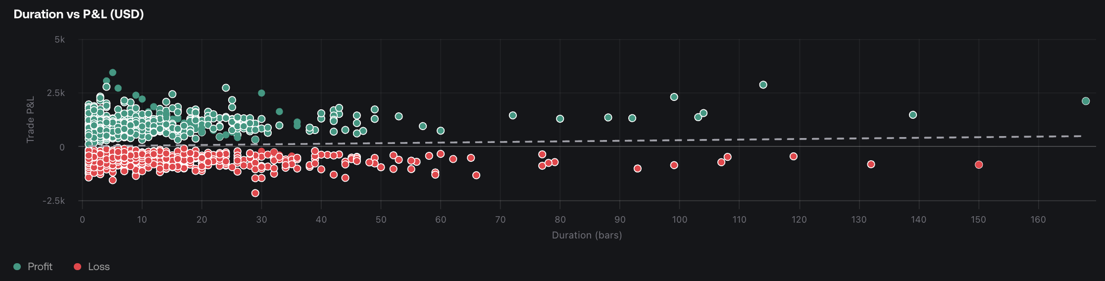
Each point represents a trade: farther right means longer duration; higher means greater P&L.
The horizontal axis measures **duration in bars** and the vertical axis measures **trade P\&L in USD**. Green points are profitable trades and red points are losing trades. Overlapping points indicate trades with similar durations and outcomes.
Look for differences between short and long-held trades, and for unusually long trades far from the main cluster. A relationship in this chart describes the observed trades; it does not establish that holding a position longer causes a better result.
Duration depends on the chart timeframe. Ten bars on a 5-minute chart represent ten 5-minute intervals; on a 1-hour chart, they represent ten hourly intervals. Session gaps can make elapsed clock time longer.
## Duration and frequency statistics [#duration-and-frequency-statistics]
[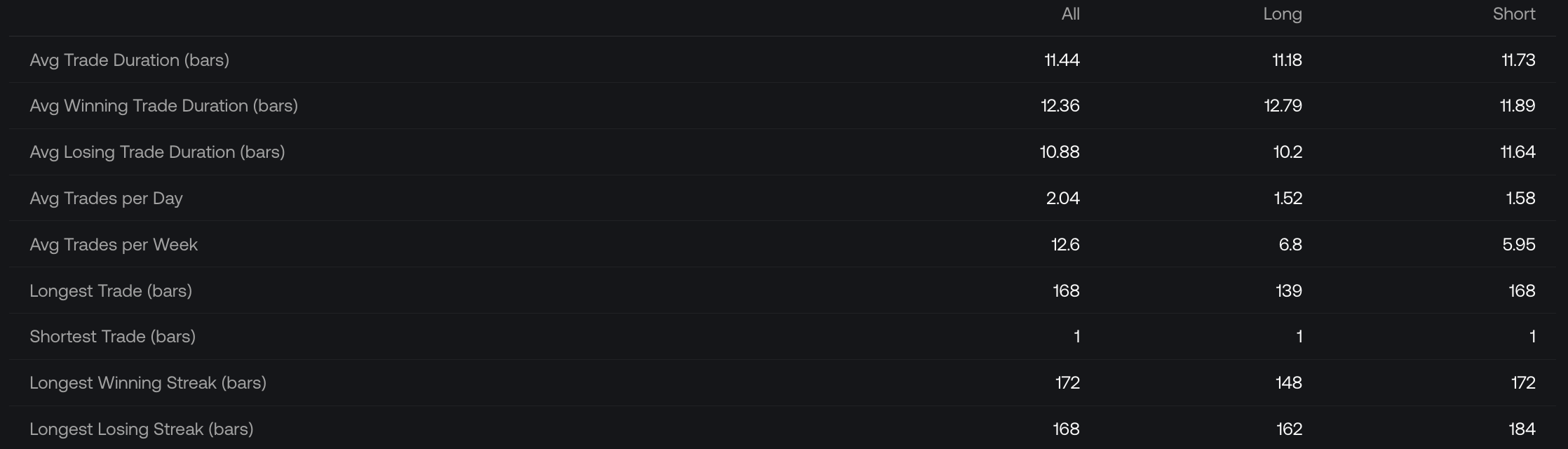](/images/charts/strategies/duration-statistics.png)
Check the units: the duration and streak rows in this table are labeled in bars.
| Row | How to read it |
| ---------------------------------------------- | ---------------------------------------------------------------------------------------------------------------- |
| **Avg Trade Duration (bars)** | Average holding duration across all trades. |
| **Avg Winning / Losing Trade Duration (bars)** | Average holding duration within each outcome group. |
| **Avg Trades per Day / Week** | Average trade frequency at the stated interval. |
| **Longest / Shortest Trade (bars)** | The maximum and minimum individual trade durations. |
| **Longest Winning / Losing Streak (bars)** | The viewer's streak-duration figures, labeled in bars. Do not read these values as counts of consecutive trades. |
The [Simulation streak table](/platform/charts/strategies/simulation#streaks--recovery) uses trades as its unit. Keep that distinction in mind when moving between the tabs.