Documentation Index
Fetch the complete documentation index at: https://docs.luxalgo.com/llms.txt
Use this file to discover all available pages before exploring further.
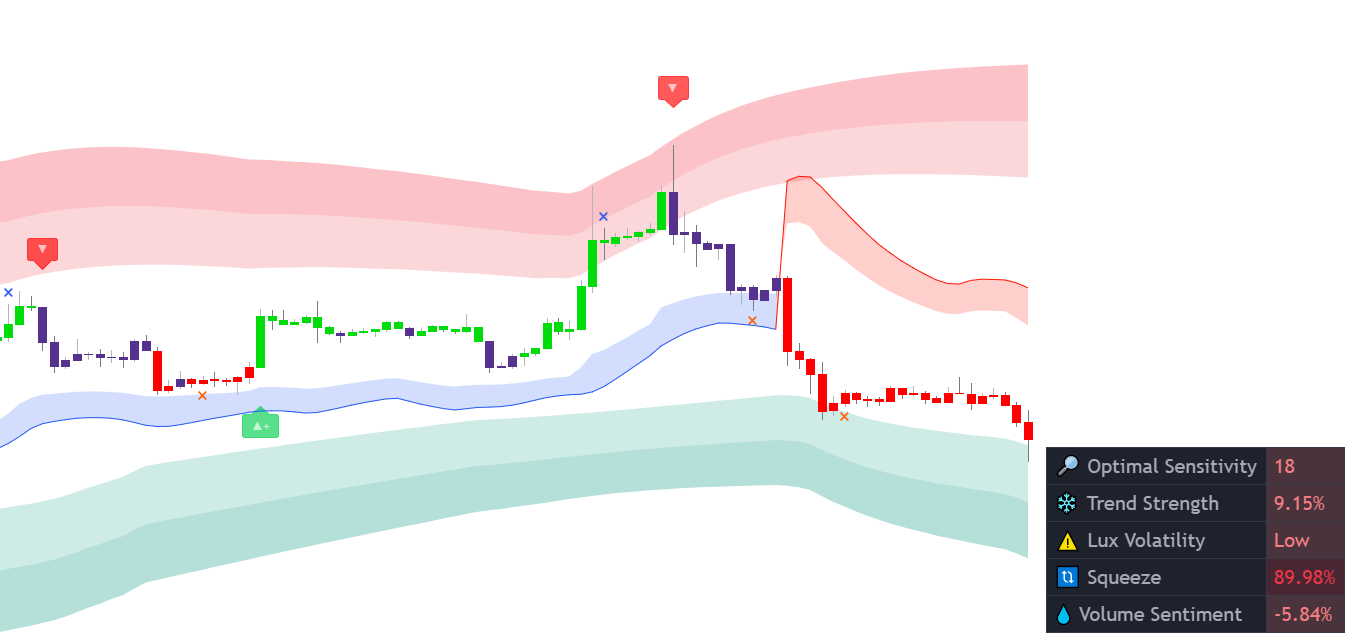 The dashboard displays the most relevant metrics from within our premium features. This feature is extremely useful to easily obtain pertinent information regarding the market and can be used in confluence with confirmation or contrarian signals.
Dashboard Elements
Optimal Sensitivity
 The optimal sensitivity is an estimate of the optimal sensitivity setting. Depending on the selected signal mode, the recommended sensitivity for confirmation or contrarian signals will be displayed. When None is selected, no optimal sensitivity will be displayed. This value is obtained through grid search optimization by using the most recent 250 bars and varies in a range between 10 and 20.
The cell color is based on the signal returned by the signal algorithm using the returned optimal setting, with a green color indicating a bullish signal and a red color indicating a bearish signal.
The optimal sensitivity is an estimate of the optimal sensitivity setting. Depending on the selected signal mode, the recommended sensitivity for confirmation or contrarian signals will be displayed. When None is selected, no optimal sensitivity will be displayed. This value is obtained through grid search optimization by using the most recent 250 bars and varies in a range between 10 and 20.
The cell color is based on the signal returned by the signal algorithm using the returned optimal setting, with a green color indicating a bullish signal and a red color indicating a bearish signal.
Note that this metric is not indicative of future results.

Trend Strength
 The trend strength quantifies the strength of an underlying trend as a percentage and can inform the trader whether the market is trending or ranging. This indication can help a trader know whether a signal has a higher chance of being false or not. The 🔥 sign is used with trending markets while ❄️ is used for ranging markets.
The cell color is based on the currently displayed signal, with a green color indicating a bullish signal and a red color indicating a sell signal.
A trend strength plot is available allowing users to set alerts based on it, using placeholders
The trend strength quantifies the strength of an underlying trend as a percentage and can inform the trader whether the market is trending or ranging. This indication can help a trader know whether a signal has a higher chance of being false or not. The 🔥 sign is used with trending markets while ❄️ is used for ranging markets.
The cell color is based on the currently displayed signal, with a green color indicating a bullish signal and a red color indicating a sell signal.
A trend strength plot is available allowing users to set alerts based on it, using placeholders {{plot("Trend Strength"}} in the alert message.
A percentage superior to 50% would indicate a trending market, while inferior percentages would indicate a ranging market.
Lux Volatility
The Lux volatility appearing on the dashboard is based on the Lux Volatility indicator and returns either Stable during periods of low volatility or Volatile during periods of high volatility. When volatility is rising the 📈 sign will appear, while 📉 appears when volatility is declining.
 The Lux volatility can also display with a warning sign, this happens when the volatility is either too low or too high and indicates extra precaution.
Squeeze
Squeeze is a measure of price compression. Higher values of this metric indicate that the market is being compressed into a tighter area, suggesting market prices are subject to damping.
 Higher values of this metric are mostly returned during ranging markets.
Volume Sentiment
The volume sentiment metric returns an estimate of whether most volume came from buying or selling participants. This measure is expressed as a percentage in the range [-100 / 100].
 The value of this metric can sometimes be high or low even if a candle does not reflect this sentiment, thus potentially indicating a reversal.
Dashboard Settings
 Enabling/disabling the dashboard can be done from the Indicator Overlay section. Settings affecting the dashboard visual style can be found in the Advanced Settings section.
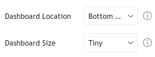
Dashboard Location
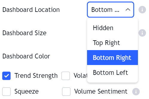 Determines the corner where the dashboard is displayed on the chart. Selecting “Hidden” will hide the dashboard.
Dashboard Size
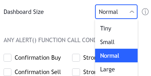 Determines the size of the dashboard on the chart, options include Tiny, Small, Normal, and Large.