
Overview
Set up a chart: layouts, symbols, timeframes, chart types, and settings.
Vela, our next-generation charting platform, gives you state-of-the-art charts for every market. Each chart shows one market. Change the symbol, timeframe, and style from the topbar, or type directly on the chart. Click the chart first so it has keyboard focus, then a letter opens symbol search and a digit starts a timeframe change.
Charts live in a workspace, which also holds your panels, including the watchlist. Open them at vela.luxalgo.com.
This page covers the chart itself. Replay Mode, Drawings, Indicators, Pine editor, Screenshots, and Order Flow each have their own page, and every keyboard and mouse shortcut is collected in Shortcuts.
Layouts
The topbar Layout control sets how many charts share the workspace:
| Layout | Arrangement |
|---|---|
| Single | One chart (default) |
| 2 side by side | Two columns |
| 2 stacked | Two rows |
| 4 grid | 2×2 |
| 8 grid | 4×2 |
The layout picker also lets you preview a custom grid before applying it. Drag the splitters between cells to resize them; double-click a splitter to even the split.
The active cell
In a multi-chart layout, exactly one chart is active: the one you last clicked. Everything that targets "the chart" targets this cell: symbol changes, timeframe changes, drawings, indicators, and scripts from Quant. If an action seems to land on the wrong chart, check which cell is active first.
Every plan, including Free, supports up to 16 charts per tab. Sign in to use multi-chart layouts.
Sync charts together
In the layout picker, Sync links properties across charts. Each can be toggled independently:
- Symbol: changing the ticker on one chart updates every linked chart. Useful for watching the same market on several timeframes at once.
- Interval: changing the timeframe updates every linked chart. Useful for comparing several markets on the same timeframe.
- Crosshair: the cursor lines up across charts, so you can read the same moment in time on every cell.
Sync drawings on all charts is separate: it lives on the drawing toolbar and copies your drawings across cells.
Change the symbol
Click the symbol in the topbar, or type a letter on the chart, to open Symbol Search.
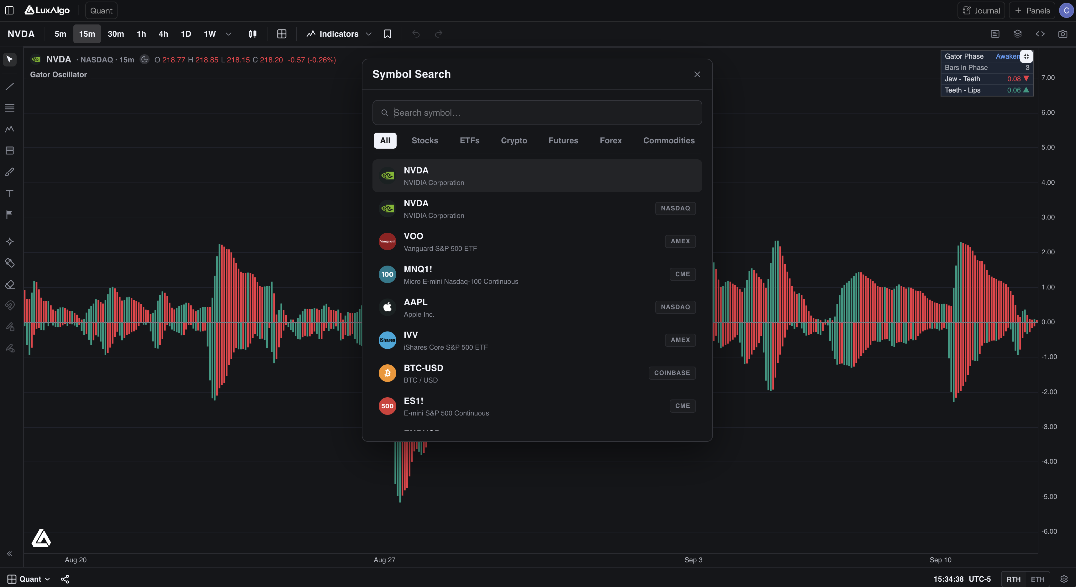
The search is organized in tabs: All, Stocks, ETFs, Crypto, Futures, Forex, Commodities. By default a symbol resolves to its primary venue; to pin a specific venue, use the PROVIDER:SYMBOL format, for example binance:BTCUSDT for Binance spot rather than an aggregate. Which venues exist per market, which plans can open them, and which of them provide order-flow data, is covered in Data.
Use the arrow keys to move through results and Tab / Shift+Tab to switch market tabs. A side panel shows details for the highlighted symbol, including the other venues it trades on under Also trades as. Searching a pair without a separator, such as BTCUSD, also finds venues that write it as BTC-USD or BTC/USD.
Change the timeframe
Click the timeframe caret in the topbar. It opens a field where you can type any interval, for example 22m, 3h, or 2D:
- Enter charts the first match, and ↑ / ↓ move through the matches.
- Shift+Enter charts it and also pins it to the topbar as a one-click chip.
- With the field empty, it lists the presets (1m, 5m, 15m, 30m, 1h, 4h, 1D, 1W, 1M) and a Recent list of the last four custom intervals you used.
Presets are available on every plan. Custom intervals need a paid plan; on Free they are marked Upgrade.
Faster: type a digit on the chart to open the same field with that digit already entered, then finish typing it:
| You type | You get |
|---|---|
15 | 15 minutes (a bare number is minutes) |
4h | 4 hours |
D | 1 day |
3M | 3 months |
Star the timeframes you use often in the list. Starred intervals show as one-click chips.
Where the symbol has trading sessions (US equities, futures-style calendars), the bottom bar can switch between RTH (regular trading hours: only the main session) and ETH (extended trading hours, including pre- and post-market).
Chart types
Open the chart style control in the topbar:
- Candles (default), Bars, Line, Area, Baseline, Heikin Ashi: standard price representations, all built from OHLC data.
- Footprint: replaces each bar with a per-price breakdown of bid vs ask volume. This is order-flow data, so it needs a symbol that provides it.
- TPO: Time Price Opportunity session profiles, showing how much time price spent at each level.
Footprint and TPO are full chart types with their own settings and their own documentation. See Order Flow.
Replay Mode
Use Replay in the chart controls to study historical price action one candle at a time. Choose a start date or a candle with the history slider, set the update speed, and begin playback. The toolbar can float or be docked/pinned, and replay supports multi-chart layouts.
Replay Mode is free with a signed-in account and runs in your browser. See Replay Mode for the full walkthrough.
Settings
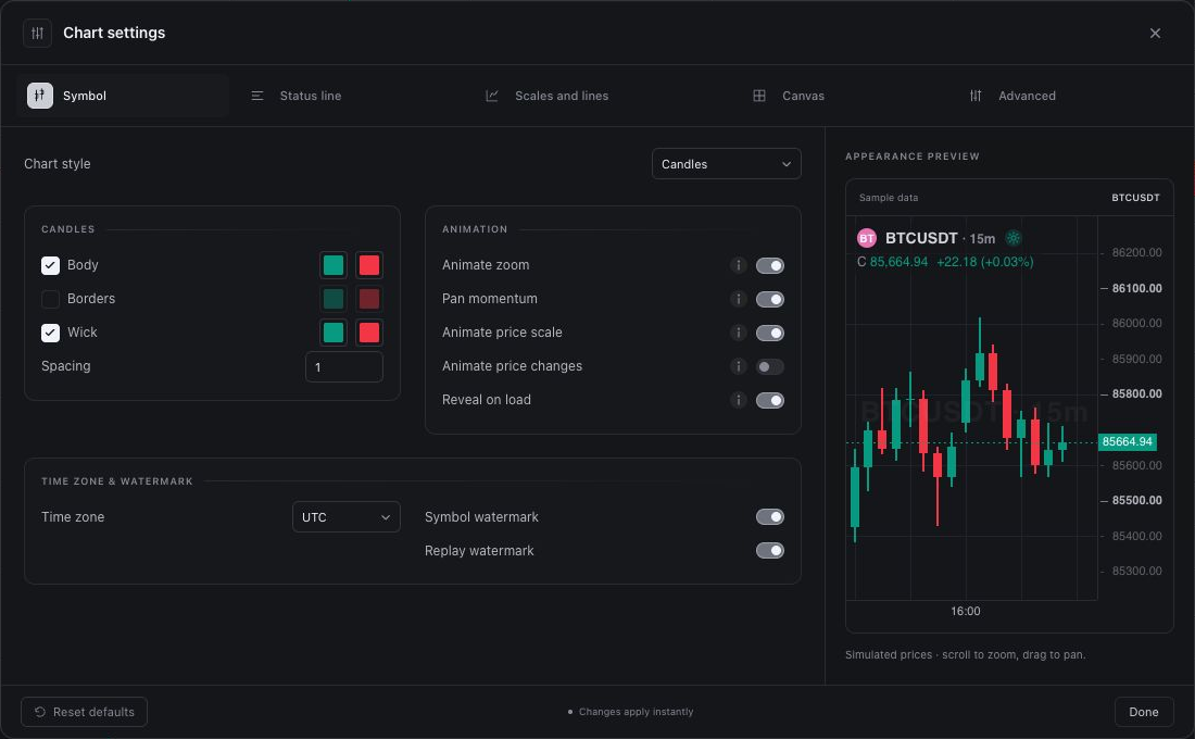
Open Chart settings from the gear, or right-click the chart and choose Settings…. The dialog has these tabs:
| Tab | What it controls |
|---|---|
| Symbol | Chart type, candle/bar/line colors, animation, time zone, trading session, watermark |
| Status line | Symbol name, market status, OHLC and bar change values, indicator titles and values |
| Scales and lines | Price scale mode, invert scale, last price line, countdown to bar close, crosshair |
| Canvas | Background, grid, text size (8 to 14 px), color theme (Dark / Light) |
| Events | News, earnings, dividends, splits, and economic releases shown on the chart |
| Advanced | Number of bars to fetch |
When Footprint or TPO is the active style, the dialog gains additional tabs for that chart type's own options.
Price scale modes
Under Scales and lines (or by right-clicking the price axis):
- Regular: linear price.
- Percent: moves shown as % change from the left edge of the visible range. Good for comparing magnitude across assets with different prices.
- Indexed to 100: like percent, but rebased so the first visible bar equals 100.
- Logarithmic: equal vertical distances are equal percentage moves, not equal dollar moves. The usual choice for long histories and for assets that have grown by multiples.
Invert scale flips the axis upside down.
Live price animation
Open Chart settings → Symbol → Animation to control movement on the chart:
| Setting | Effect |
|---|---|
| Animate zoom | Glides between zoom levels. |
| Pan momentum | Lets a finger flick on a touch screen glide to a stop, and eases navigation pans such as scrolling to the latest bar. A mouse drag always stops where you release it. |
| Animate price scale | Glides the scale to its new range while zooming or panning. |
| Animate price changes | Glides the live bar to each new price instead of snapping. |
| Reveal on load | Animates candles when a chart first loads; takes effect on the next load. |
Turn off an animation if you prefer immediate visual transitions. These controls change how chart movement is displayed.
Faster paths
- Right-click the price axis: scale mode, including log and invert.
- Right-click the time axis: time zone.
- Press
0with the chart focused to fit content to the viewport.
Control Symbol watermark and Replay watermark in the Symbol settings.
Inspect what's on the chart
The right-hand panel rail opens two inspection panels:
- Object tree: every drawing and indicator on the chart as a list: show/hide, lock, reorder, or remove each one. This is the fastest way to clean up a crowded chart.
- Data window: the exact values of every plot under the crosshair, useful when several indicators overlap.
Market events
Event markers along the chart's bottom edge put news, company events, and economic releases beside price action. You can review historical events and look ahead to upcoming events where data is available.
Choose which events appear
- Open Chart settings using the gear at the bottom-right of the chart.
- Select Events.
- Use the News & company events and Economic releases groups to turn the categories you want to see on or off:
| Control | What to select |
|---|---|
| News | Use the Latest news and All news options to choose the news shown. |
| Earnings | Show company earnings events. |
| Dividends | Show dividend events. |
| Splits | Show stock split events. |
| Economic releases | Choose High impact, Medium impact, and Low impact releases. |
Close settings to return to the chart. Pan along the time axis to inspect the dates you want to review, including earlier events and upcoming dates. The available events depend on the selected symbol and event data.
Event display
The Event display group in Chart settings → Events has two controls:
- Show future event lines adds connector lines for upcoming events.
- Highlight the move on hover controls the price-move highlight when hovering an event.
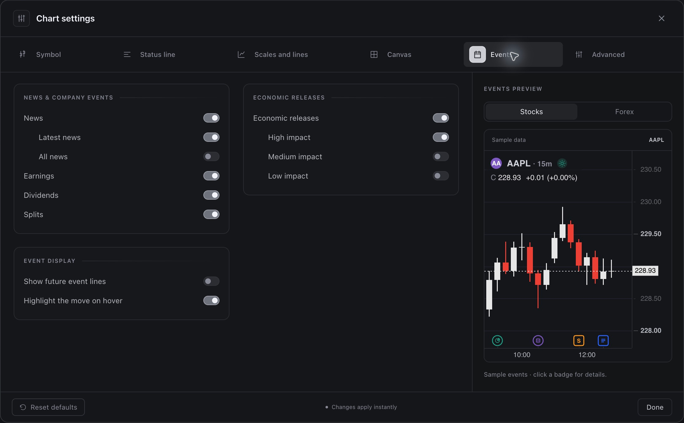
The Events preview uses sample data. Choose Stocks or Forex in the preview to inspect the example event display; use the actual chart to review events for your selected market.
Read an event
Click a marker at the bottom of the chart to open its details. The information depends on the event type and available data:
- News shows a linked headline, its source, and publication time.
- Earnings can show the event date, EPS and revenue alongside estimates, and a result such as EPS beat.
- Dividends can show the ex-dividend date, amount, record date, payment date, declaration date, and payment frequency.
- Splits show the split ratio and effective date.
- Economic releases show the release name, time, country, and Actual, Estimate, and Previous values where available. One marker can open several releases.
Upcoming earnings are labeled Earnings (scheduled) and can show EPS and revenue estimates. Check the event date when distinguishing past from upcoming events: an economic entry can still display Scheduled when numeric figures are absent, even after its listed date.
Read each date label carefully: a dividend's ex-dividend date and payment date describe different parts of the same event.
For a searchable headline feed across the symbols in your watchlist, use Watchlist → Advanced view → News. That feed is separate from the event markers on the chart.
Screenshots
Open the camera icon on the right-hand rail to Copy to clipboard, or capture the full chart or a selected portion for a PNG export. In the preview, choose Chart or Styled, control whether to include indicators and a frame, and download the image. See Screenshots for the full workflow and how it differs from sending a chart image to Quant.
Alerts
How many alerts you can run depends on your plan: Free 5, Essential 50, Premium 100, Ultimate 200, AI Ultra 500. Webhook alerts are available on Premium, Ultimate, and AI Ultra.