
Advanced view
Performance, relationships, a full symbol table, single-symbol research, and exposure for the open list.
Advanced view opens the full watchlist over the terminal. Open it with Open advanced view (the expand arrows) in the docked panel, or drag the panel's edge wide and it expands on its own. The same list, add, rename, and delete controls sit in the header. Return to chart puts the panel back.
The page reads top to bottom. The links under the title (Overview, Relationships, Symbols, Research, and Exposure) jump to each part.
Overview
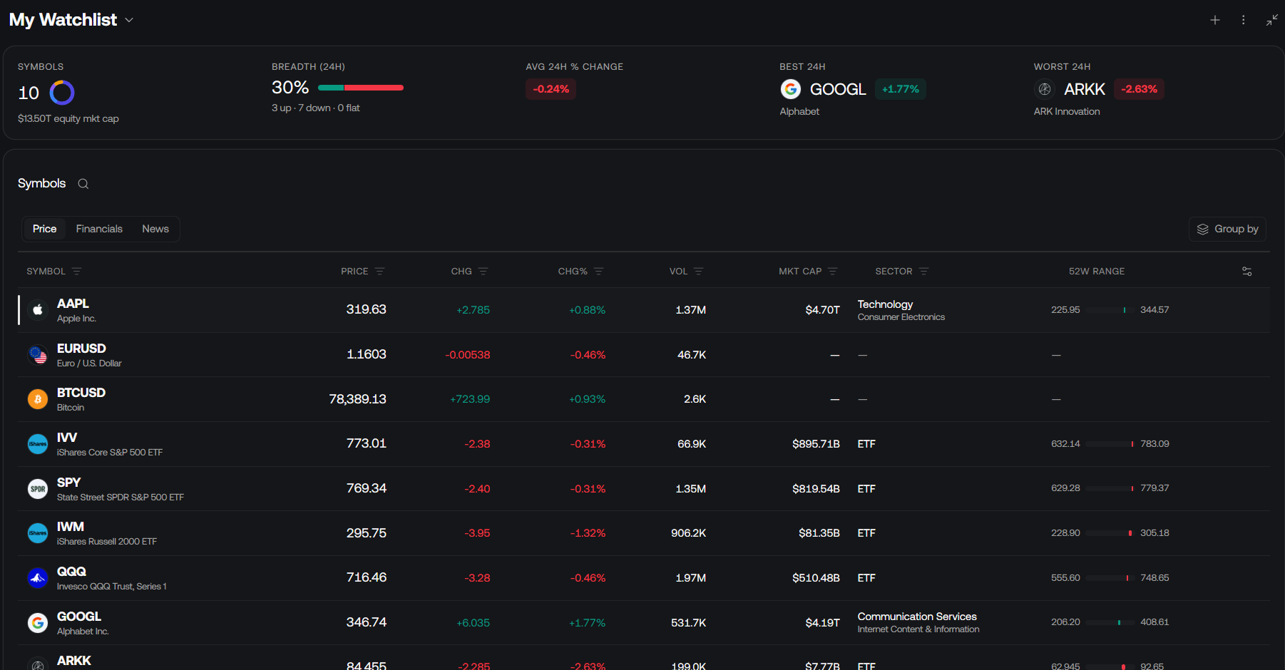
Five metrics lead the page when the list has symbols:
- Symbols: the count, with a ring by asset class and the total equity market cap
- Breadth (24h): the share of names that are up, with up / down / flat counts
- Avg 24h % change
- Best 24h and Worst 24h: the day's extremes on this list (the best is not always a gainer)
Performance over time puts every symbol on the same percentage scale, starting at 0% on its first date in the period. Pick 1M, 3M, 6M, YTD, or 1Y. Toggle symbols in the legend below the chart (or Show all / Hide all) to compare a few, and drag across the chart to zoom. Hover for a tooltip that ranks every line at that date. Best in view, Lowest in view, and Coverage sit above the chart. The returns use daily closes in each instrument's quote currency, and exclude dividends and today's partial day.
Market pulse shows the day's move for each symbol as equal-sized tiles, tinted by the size of the move. Narrow it by asset class or to Gainers or Losers. Choose a tile to open that symbol in Research.
An empty list just asks you to add symbols.
Relationships
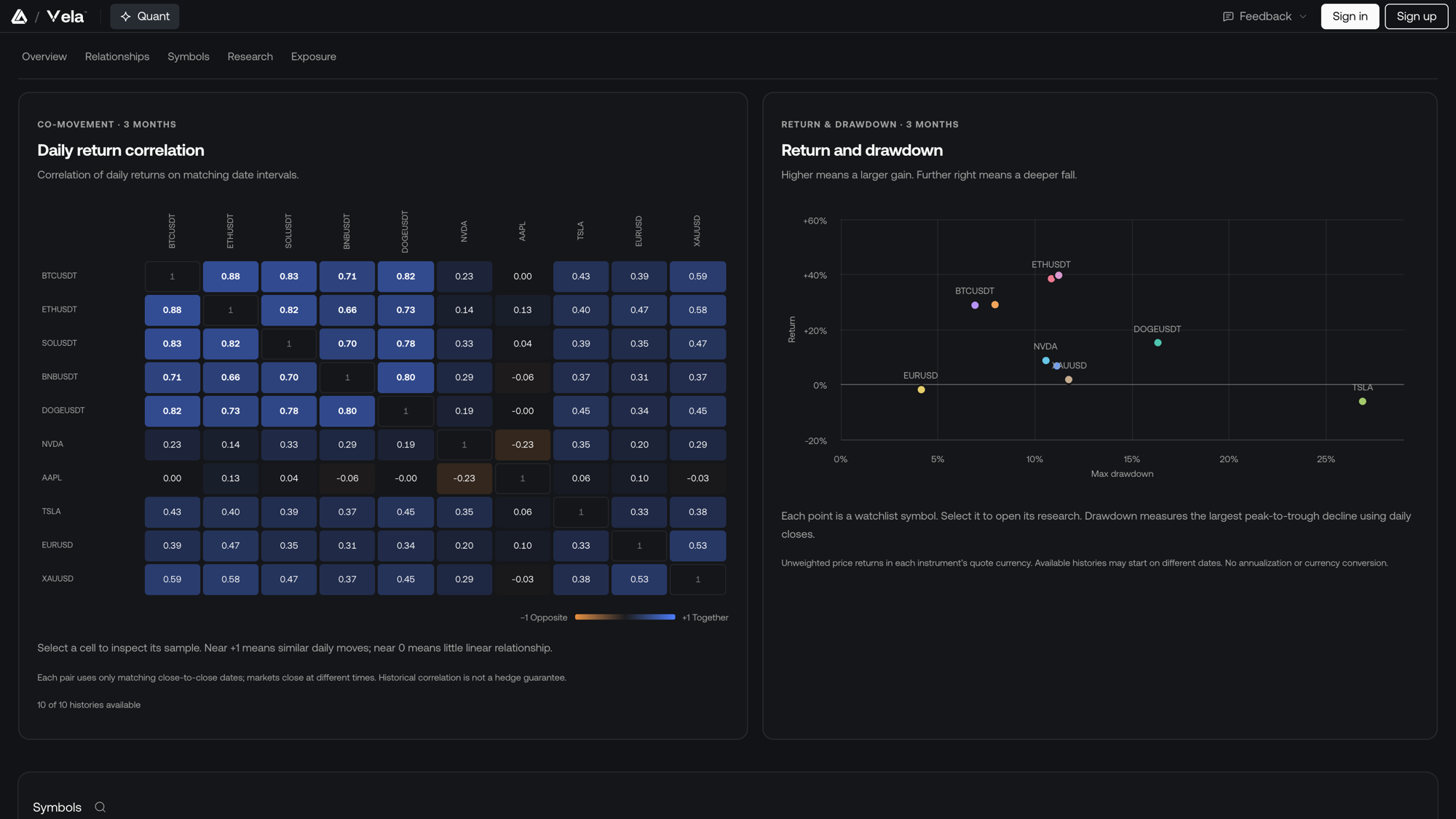
Daily return correlation compares every pair on the list over three months, using only the dates both markets closed. Near +1 means the two move together; near 0 means little linear relationship; negative values move opposite. Select a cell to inspect its sample. A pair needs at least 20 matching daily returns. Historical correlation is not a hedge guarantee.
Return and drawdown plots each symbol's three-month return against its largest peak-to-trough fall. Higher means a larger gain; further right means a deeper fall. Select a point to open that symbol in Research.
Symbols
The symbol table has four tabs.
- Price is market data: symbol and name, price, change, change %, volume, market cap, sector, and a 52-week range.
- Performance shows a 30-day sparkline, returns over 1W, 1M, 3M, YTD, and 1Y up to the live price, the one-year max drawdown, RSI 14, and the trend (the close against its 20- and 50-day EMAs).
- Financials is company data: revenue, net income, EPS, P/E, dividend per share, yield, and beta.
- News is a headline feed for the symbols on the list. Narrow it to specific names, or search headlines.
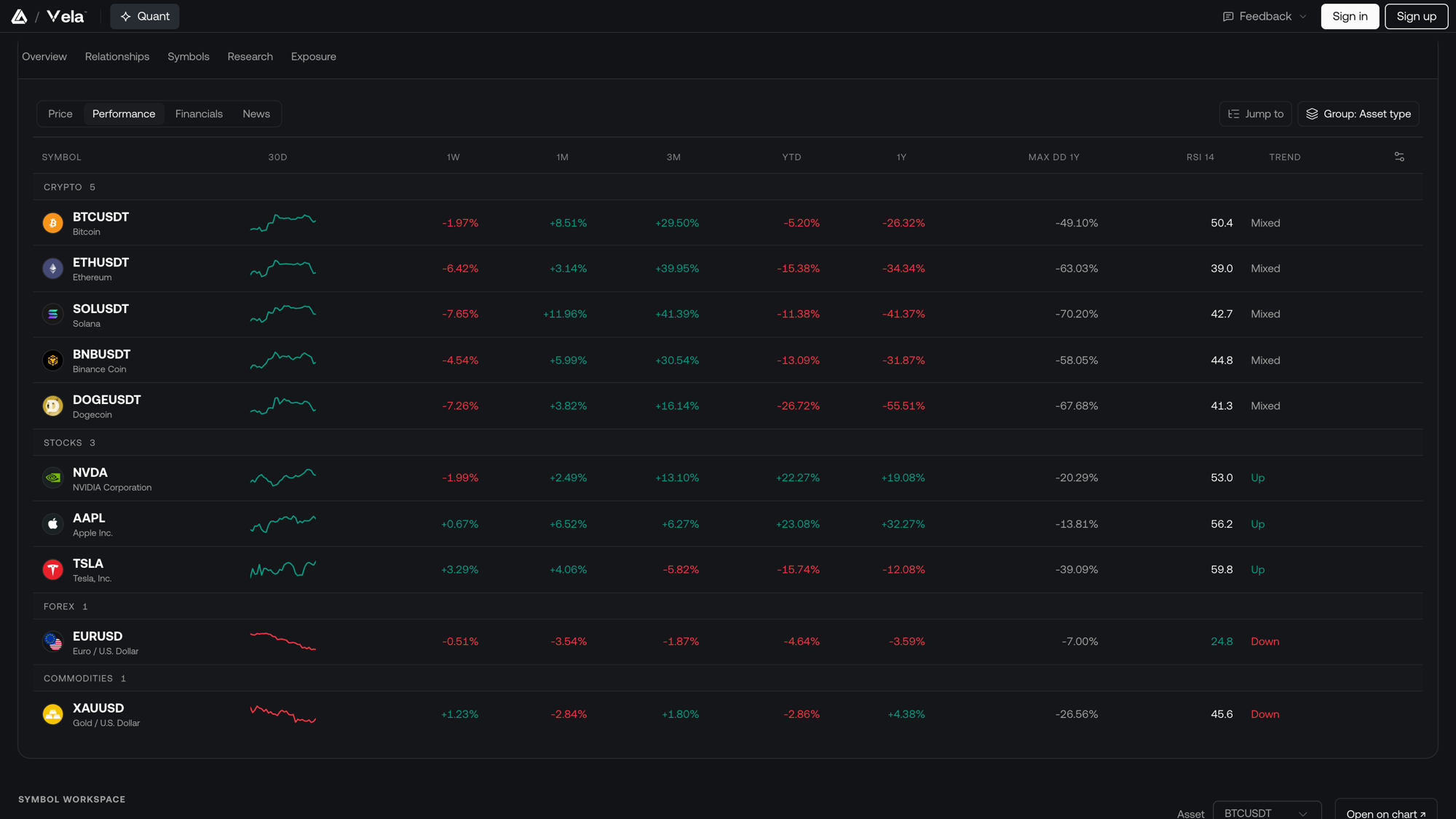
Search (the magnifying glass) filters the open tab. Group clusters the rows by Asset type, Sector, Exchange, or Currency, or turns grouping off. Jump to scrolls to a group header.
Column headers sort. The filter on a header narrows by number (≥ / ≤) or by a checklist; the Symbol filter can also hide asset types. Column settings shows or hides columns, and you can drag a column to rearrange it. That order is saved with the workspace.
Hover a row for Remove. Right-click a row for:
- Replace: swap that symbol through Symbol Search
- Go to chart
- Add to watchlist: copy it onto another of your lists
- Add symbol
Research
Symbol research looks at one symbol in depth. Choose it from Asset, or select a symbol from Market pulse or the Return and drawdown chart. Open on chart loads it on the active chart.
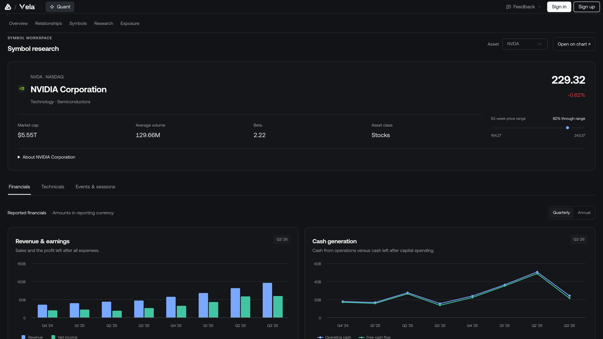
The header shows the price, the day's change, and the session's open, low, and high. For stocks it adds market cap, average volume, beta, the 52-week range, and About the company. Underneath are up to three tabs:
- Financials (stocks): reported revenue and earnings, cash generation, the balance sheet, profit margins, revenue by business, and analyst ratings, Quarterly or Annual.
- Technicals: the daily close against its 20- and 50-day EMAs, and a Momentum & range read from five checks (price against each EMA, the EMAs against each other, RSI 14, and MACD against its signal), with the typical daily range (ATR 14).
- Events & sessions: the symbol's events and its market sessions.
Technicals describe historical trend and momentum, not a forecast. Analyst ratings come from the data provider and are not a Vela signal.
Exposure
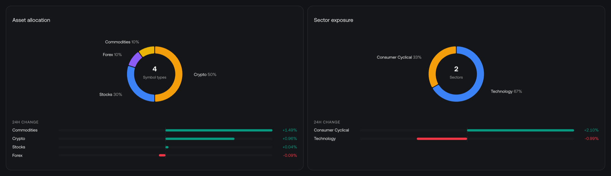
Asset allocation is a ring by asset class (Stocks, ETFs, Crypto, Forex, Commodities) with each class's 24-hour change under it.
Sector exposure does the same for stocks and ETFs by sector. It stays empty until the list has equities.
Click a symbol to load it on the active chart and close Advanced view.
Sector, market cap, 52-week range, and financials come from public company data and are available for stocks. ETFs are grouped as their own bucket: the data reports a fund's issuer, not its holdings.